Building Better Visual Projects with Architecture Icons
Every design project starts with a search for the right visual language. Whether you are wireframing a mobile app, laying out a brochure for a real estate firm, or designing an infographic about urban planning, the icons you choose shape how people understand the content. Architecture Icons are purpose-built visual assets that bring structure, clarity, and a polished aesthetic to any project that touches on buildings, construction, interior design, city planning, or spatial concepts. What sets a quality icon set apart is not just how it looks on a preview page but how easily it slides into your existing workflow and stays useful across multiple outputs.
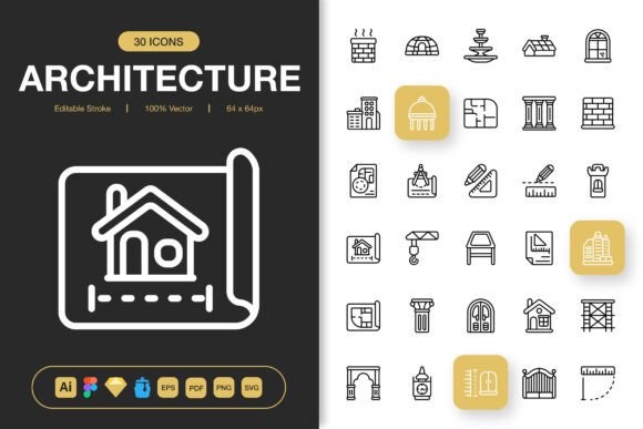
This collection covers a wide range of architecture-related symbols, from building types and structural elements to tools, floor plan markers, and urban landscape features. The set is designed with a minimalist approach, which means the icons remain clean at any scale and do not compete with surrounding content. That restraint matters more than most people realize until they drop an overly detailed icon into a sleek UI and watch it throw off the entire visual balance. Minimalist icon design works because it communicates quickly and ages well, even as surrounding design trends shift.
Where Architecture Icons Fit into a Broader Design Process
Icons are rarely the first thing you think about when starting a project, but they should not be an afterthought either. In a typical design workflow, icon selection happens after the general layout and typography direction are set but before final polish. At that stage, you need assets that are versatile enough to adapt as the design evolves. Architecture Icons fill that gap by offering a consistent visual system that you can pull from repeatedly without having to commission custom illustrations or hunt through disparate free sources that lack cohesion.
Consider a real estate marketing team preparing materials for a new development. They might need icons for the website property cards, the printed sales brochure, social media posts announcing floor plans, and an interactive map inside a mobile app. If each of those outputs uses icons from different sources, the brand feels fragmented. A unified icon set solves that before it becomes a problem. The team can pick a subset of relevant icons, apply brand colors, and know that every touchpoint will feel intentional.
In architectural education, instructors building course materials or students preparing presentation boards also benefit from a reliable icon library. Instead of spending hours drawing simple symbols from scratch, they can focus on the content and narrative while the icons handle the visual shorthand. The same logic applies to bloggers writing about home renovation, publishers laying out books on design history, and event organizers creating signage for industry conferences.
Understanding the File Format Ecosystem
One of the most practical aspects of this icon set is the range of file formats included. Different tools and outputs demand different formats, and having everything prepared in advance removes a common friction point. The source file is provided in Adobe Illustrator format, which gives you full access to the vector artwork and the ability to make deep customizations if needed. For teams that use collaborative design tools, the Figma file and Sketch file options mean you can drag icons directly into your component libraries without conversion steps.
The Iconjar file is particularly useful for designers who maintain large asset libraries. Iconjar acts as an icon organizer that lets you search, tag, and drag icons into design software without digging through folders. If you have ever wasted time scrolling through a generic downloads folder looking for the right building symbol, you will appreciate having a structured, searchable icon management system built in.
For print workflows, the EPS Version 10 and PDF file formats ensure compatibility with older software and professional printing pipelines. Many commercial printers still prefer or require EPS files for certain workflows, especially when dealing with large-format banners or posters. The SVG file format covers web and digital use, including direct embedding into HTML, while PNG transparency files at multiple resolutions—32px, 48px, 64px, 96px, 128px, 256px, and 512px—cover everything from favicon-sized assets to high-resolution screen displays. Having these sizes ready means you do not have to manually export or risk quality loss from improper resizing.
Customization and the Editable Stroke Advantage
Icons rarely arrive in exactly the style your project needs, which is why the editable stroke feature matters. With editable strokes, you can adjust line weight to match your brand guidelines or the visual weight of your typography. A thin, delicate stroke might suit a luxury interior design app, while a heavier stroke could work better for a construction safety poster that needs to be legible from a distance. The ability to make these adjustments without recreating or tracing icons saves hours across a project lifecycle.
Beyond stroke weight, the icons are built to be 100% customizable. You can change colors, adjust corner radius, modify individual shapes, or even combine elements from different icons to create hybrid symbols. For example, you might take a building outline icon and combine it with a tree element to create a custom symbol for an eco-friendly development project. Because the source files are vector-based and well-organized, these modifications are straightforward rather than a battle with messy anchor points.
Easy Drag-and-Drop Integration into Daily Workflows
The promise of drag-and-drop functionality sounds simple, but in practice it depends heavily on how the files are structured. Well-organized icon sets group symbols logically, name layers sensibly, and avoid unnecessary clipping masks or grouped objects that break when moved. This collection is built with that usability in mind. You can drag an icon from the Figma file into your component library, from Iconjar into Sketch, or from the Illustrator source file into another document without cleaning up artifacts or fixing broken paths.
For web developers working with design tokens or icon systems, the SVG and PNG files integrate directly into front-end workflows. You can map icon names to components in a framework like React or Vue, or use them as inline SVGs where you need CSS control over fill colors and hover states. Having both SVG and PNG options means you can choose the format that best suits each context—SVG for scalable icons that need to stay sharp on high-DPI screens, PNG for situations where you need guaranteed rendering consistency or are working with tools that handle raster images more reliably in certain export scenarios.
Preparing Your Icon Library Before Project Kickoff
A small upfront investment in organizing your icon assets pays off repeatedly. Before you start dropping icons into designs, take time to review the full set and identify which symbols are most relevant to your typical projects. Tag or group them in your design tool of choice. If your team works across multiple projects, create a shared component library with your preferred icon selections already styled with brand colors and stroke weights. This turns a one-time purchase into a reusable asset system that speeds up every future project.
For freelancers who juggle clients with different visual identities, maintaining a master icon file alongside client-specific variations keeps things manageable. The editable nature of the icons means you can quickly restyle a subset for a new client without starting from scratch. This approach scales well as your client roster grows and you need to produce consistent work efficiently.
Consistency Across Digital and Print Media
One challenge that surfaces repeatedly in multi-channel projects is maintaining visual consistency when the same icon needs to appear on a website, in a printed brochure, and on social media graphics. Differences in resolution, color profiles, and rendering engines can cause subtle shifts that undermine a polished presentation. Starting with a single, high-quality icon set that provides appropriate file formats for each medium removes much of this variability.
For print, the vector-based EPS and PDF files preserve crisp edges at any size, whether you are printing a small icon on a business card or blowing it up for a trade show banner. For digital, the SVG and PNG files cover modern and legacy requirements respectively. The PNG transparency files at graduated sizes also help when you need to provide assets to non-designers who may not have vector editing software. Someone in marketing who needs an icon for a PowerPoint presentation can grab the 256px PNG and know it will look clean on screen without understanding file formats at all.
Use Cases Across Different Project Types
The versatility of architecture-themed icons makes them applicable far beyond architectural firms. Websites for property listing platforms, co-working spaces, or construction companies benefit from icons that communicate location, building features, and amenities. Mobile apps for navigation, smart home control, or renovation planning need clear visual symbols that users recognize instantly. Books and e-books about design history, urban studies, or DIY home improvement use icons to break up text and illustrate concepts without requiring full illustrations on every page.
Social media content creators covering architecture, interior design trends, or city photography can use icons as overlays, story highlights, or carousel slide markers. Infographics about housing markets, sustainability in construction, or urban population shifts rely on icons to make data more digestible. Flyers, banners, and posters for open houses, design conferences, or community planning meetings need icons that are legible at a distance and reproduce well in print. The same set scales across all these contexts without looking out of place.
Quality Control and Long-Term Reliability
High-quality icons are built with attention to detail that becomes apparent over time. Consistent stroke widths, aligned grid placement, balanced optical weight, and careful simplification of complex shapes separate professional icon sets from quickly assembled alternatives. When you use an icon in a design, you want to know that it will hold up under scrutiny—no awkward curves, no inconsistent spacing, no shapes that collapse into unrecognizable blobs at small sizes. The craftsmanship in this set means you can use the icons confidently in high-stakes projects where quality expectations are high.
Long-term use is another consideration. Design tools and file format preferences evolve, but well-constructed vector artwork remains usable across software generations. The inclusion of source files and multiple export formats provides a form of future-proofing. Even if your team switches from Sketch to Figma, or from Illustrator to a newer vector tool, you have the assets covered.
Integrating Architecture Icons with Other Design Resources
Icons do not exist in isolation. In most projects, they sit alongside photography, illustrations, typography, and UI components. The minimalist design of this icon set means it pairs well with a broad range of visual styles. Clean line icons complement sans-serif typography and photography-heavy layouts without adding visual noise. They also work alongside more decorative illustrated elements when you need the icons to play a supporting rather than starring role.
For designers who use design systems, these icons can become part of a larger component library. Map them to specific functions or content types within your system, document usage guidelines for your team, and treat them as a living asset that evolves with your brand. The included Readme.txt file provides essential information about the set, but you will want to extend that with any project-specific conventions you establish.
Practical Tips for Efficient Icon Usage
When you start working with a new icon set, resist the urge to use too many different icons in a single layout. A focused selection of relevant symbols creates a stronger visual identity than trying to showcase every icon you have available. Choose icons that serve a clear communicative purpose rather than decorating empty space. In UI design especially, icons should help users navigate or understand content; decorative icons that do not add meaning can increase cognitive load instead of reducing it.
Also consider accessibility. When using icons in web or app interfaces, pair them with text labels for important functions, and ensure sufficient color contrast against backgrounds. The editable stroke option helps here—you can adjust line weight to improve legibility for users with visual impairments. For print materials, test icon legibility at actual print size before committing to a final layout, especially for smaller formats like business cards or booklet interiors.
Making the Most of a Professionally Built Icon Set
The difference between a good design and a great one often comes down to the quality of the small elements. Icons are almost always present in modern visual communication, and the cumulative effect of using consistent, well-designed symbols across all your materials signals professionalism and attention to detail. Whether you are a solo designer building a portfolio, an agency serving multiple clients, or a business owner creating your own marketing materials, having a reliable icon resource saves time and elevates output.
This architecture icon collection addresses the practical realities of design work: multiple software environments, varied output formats, and the need for customization without friction. The combination of editable strokes, drag-and-drop readiness, and comprehensive format coverage means you spend less time preparing assets and more time designing. In a field where deadlines are tight and quality expectations are high, that efficiency translates directly into better work and a smoother creative process.